Solar Taxi
How to make a game that's replayable with limited resources by creating simple complementary systems.
The Problem:
Solar Taxi was an extremely fun project to work on because it had many different challenges to solve. The business goal was to expand LeapFrog's curricular portfolio with astronomy; but the amount content requested to put into the game created budgeting and scheduling issues. I needed to find cheap ways to create a game that had the request for rich content but still offered a deep and replayable game in order to expose all the content we had lined up. So how do I design a game to make all this work? Here's my answer put resources towards areas where we can get the most use out of it, and reuse assets where we can in unique ways. In this writeup I'll talk about how I created a system that was maximized for the best user experience in 4 areas:
Level Design
Currency System
Upgrade System
Passenger Requests
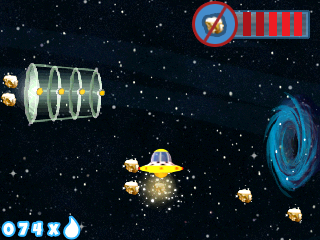
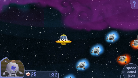
Here's a little background info on Solar Taxi to help you understand the write up. Solar Taxi is a game about picking up alien passengers and taking them to their requested destination...but it's not that straight forward. Passengers sometimes forget where they are going or give you long descriptions of the place they want to visit instead of the planets name, and it's up to you to figure it out by learning about our solar system. Picking up and dropping off the passenger is full of engaging mechanics and challenges like requiring the player to change its polarity colors to match the obstacle's color to break through or picking up space ores to sell for tokens. Here's link to the game's trailer for a better idea.
1) Level Design
One of the issues that happen with level focused games is player fatigue. This is one of the worst problems to have. Players get bored and want to move on to the next thing and never comeback. This usually happens when they experience a pattern then learn that pattern quickly. Humans are good at learning patterns; our brains constantly look for it. How do we solve for this in a way were we can continue to get players to play for a long time so that we can expose all the astronomy content?
Well we are in space! Space is empty! So I got pretty lucky in terms of amount of unique assets we needed to create for background, foreground and other filler space objects to populate the environment. So I used this saving to my advantage to create contrast in play with two types of level design system: Slower moving self-guided and a faster moving modular auto-scrolling level.
Creating this contrast of play is immensely important, because it prevented player fatigue. We had a limited amount of levels that the player was going to play repeatedly. We needed a way to make moment to moment play very refreshing and engaging. Here's how each of the levels design work to create a replayable system.
Self-Guided Levels:
Mock up of self-guided level
The game had 12 self-guided levels that were designed by hand. These levels are the bulk of the gameplay experience. The goal of the level design was engaging replayability with three supporting gameplay pillars: exploration, unique challenges, and readability. Level design was designed with all these in mind.
Exploration:
Since the levels were self-guided, the player was able to take their time to explore the environment and to find secrets warp areas that either lead to more currency or shortcuts to bypass hazards. Kids were into flying all around the levels searching for all the secrets. We omitted any standardized level timer so kids can explore without feeling they would loose if they spent time looking instead of getting the passenger to the final destination right away.
Unique Challenges:
We had limited amount of mechanics but we had enough to create a variety of play patterns. The best way to approach the level design was to theme each of 12 self-guided levels we have after level mechanics and hazards like the warp area, black hole area, or boosters area. The level designer were requested to pick 1-2 mechanics and design the level using only those. We were able to make levels themed and feature mechanics we had like black holes and boosters. Each level felt different and unique that offered a cohesive design that players can explore.
Readability:
Readability of the levels is important; to define what I mean by this is that at any given point the player needs to understand where they are in the level and the spatial relationship clear enough to recognize where they need to go to progress. One of the unique challenges about making the levels read well was the lack of unique assets; however, with clever use of assets and mechanics that we had we were able to create memorable moments and landmarks that solved the issue of readability.
Creating memorable moments with the Booster (gray arrow boxes) so player knows where they are at. (Rough Level Map)
For example, memorable moments could be created with boosters back to back to back mid way through the level. On subsequent plays the player would recognize this pattern and know it marks the half way point.
Landmarks created by hazards: static and moving asteroids and loot. (Rough Level Map)
Landmarks on the other hand can be created using a variety of items but the most useful and were the collision objects like asteroids. We'd create formation shapes like circles, walls, and funnels that the player can use as a landmark to guide them.
Auto-Scrolling Levels:
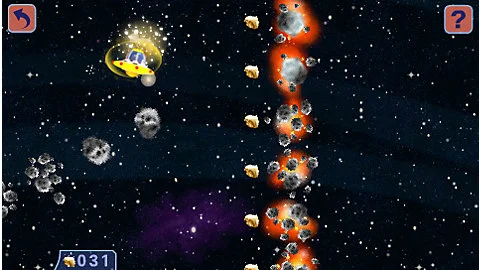
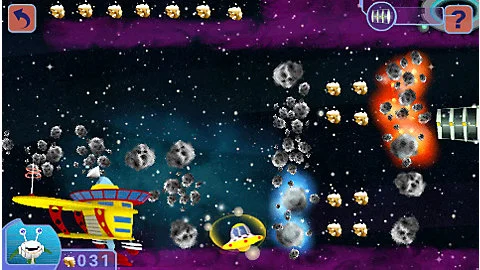
In-game shots of pre-made tiles dynamically stitched together to create a level.
The auto-scrolling levels provided a unique interaction by giving the player a fast pace action sequence to go pickup the passengers. We couldn't afford to make more full self-guided levels, so we created a system in which dynamic tiles were stitched together to create an auto-scrolling level. We created quite a few tiles that had different challenges and collectibles on them. These tiles were designed in a way where any of them can be put together in a seamless manner. During game time the system would pull the tiles from a bank and arrange them (based on defined rules) for the player to traverse.
2) Passenger Request Challenges
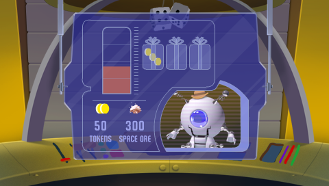
Another system we chose to invest in and capitalized on is the challenge request system. It's very a simple system but the benefits allow us to make the 12 self-guiding levels be extremely replayable. At the start of each ride the passenger will have a special request for the player to accomplish. These requests range from collecting X amount of Space Ores to avoiding hitting obstacles Y times. They took advantage of items already being track. If the player fulfills the request then the passengers gave the player a gift for their fulfillment. The player can chose from 1 of 3 wrapped surprised boxes that hid different amount of tokens to buy upgrades with.
3) Upgrade System
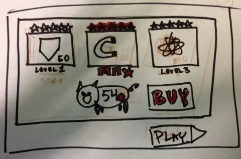
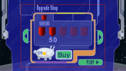
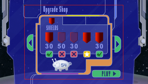
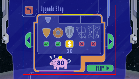
The one system that I relied heavy on for replayability was the upgrade system. It provided an over arching long term goal. This was extremely important in driving the player...however the issue we had was our lack of art to show upgrades the player bought. This was extremely tricky to solve. The key element in getting this to work was giving the player a tiny bit of evidence that the upgrade exist and having a huge amount of faith in the player. Let me explain what I mean by having faith in player. We had to trust the player to play along and believe that the upgrades they are buying or bought really works. So we had to design the screen to convince the to play a long and believe. We did this by: Showing progression in the upgrade visuals and pricing (and in game a different feel to the Solar Taxi) but no art upgrades.
In each of the screen above we made the mock up to solve the issue stated. We needed to convey to the user each tier of upgrade is a progression. In the first rough mock up we had three different categories with the stars marking progression...but this was not enough.
in Mock Up v2 we separated out the categories to look like there was more and then made individual upgrades into single icons, but progression wasn't clear enough.
In Mock Up 3 we added icons to show which is upgraded but the iconography wasn't very clear.
In the final mock up we made each individual upgrade get bigger and fancier. The progression icon was clearer. It was also clear showing which one was bought, which is next to buy and which one has not been bought yet. The pig was transformed in the buy button because we saw in kid testing sessions kids were tapping on it to try to buy the item sleected.
4) Currency System
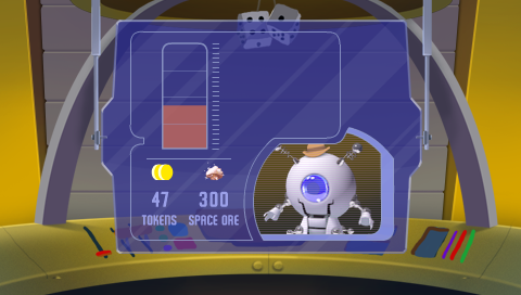
Another issue we had was making the player feel they are accomplishing and progressing. The items that they collected in the levels needed to feel like they were worth something but the numbered amount that they will collect needs to not feel overwhelming to keep track of either. We solved this by creating two types of currency. Space Ores and Tokens. Space Ores are collected in level and are converted into Tokens. Tokens were used to buy upgrade items in the space store. The tokens were the key to allowing us to have a massive amount of Space Ores for the players to collect during levels to feel satisfied. We made the payoff screen handle all the conversion in a pleasing manner that didn't overwhelming the player with managing it. Players don't need to know the exact amount they've collected; the only thing they needed to seeing are the fruits of their labor, which was portrayed by the space ore meter filling up with space ores to make Tokens (150 Space Ores = 1 Token). This allowed us to make the moment to moment play engaging in the levels and at the same time allowed the player to manage a smaller amount of tokens in order to make clear decisions on upgrades.
Summary
There will always be challenges to deal with when working on any project; however, having a clear goal and what you and the organization want to accomplish helps you create a solution. With Solar Taxi the business goal was to incorporate a great deal of curriculum and my challenge was how do we expose all the curriculum with the limited resources for unique assets. In Solar Taxi the two type of levels we had prevented player fatigue by alternating the pacing, the passenger challenge requests changed the goal of each level slightly and made the same levels feel different, while the currency collected in the levels gave a sense of progression and engaged the player moment to moment, and lastly the upgrade system gave players a longer over arching goal and reinforced progression overall. All these elements combined made a relatively low asset resource game into one that had depth and replayablity. Find ways to create simple systems that work with each other and by doing this it'll strengthen the system as a whole and give the experience more depth.
Solar Taxi
Curriculum: Astronomy: Earth and Space Science, Making Observations, Thinking Like a Scientist.
Demographic: Age 5-8
Platform: LeapPad 2
“This game taught my 4 yr old all about the solar system. She knows all the planets and can even tell me what they’re made of and how far they are from the sun. She loves it and I’m glad she is getting a head start on astronomy.”

